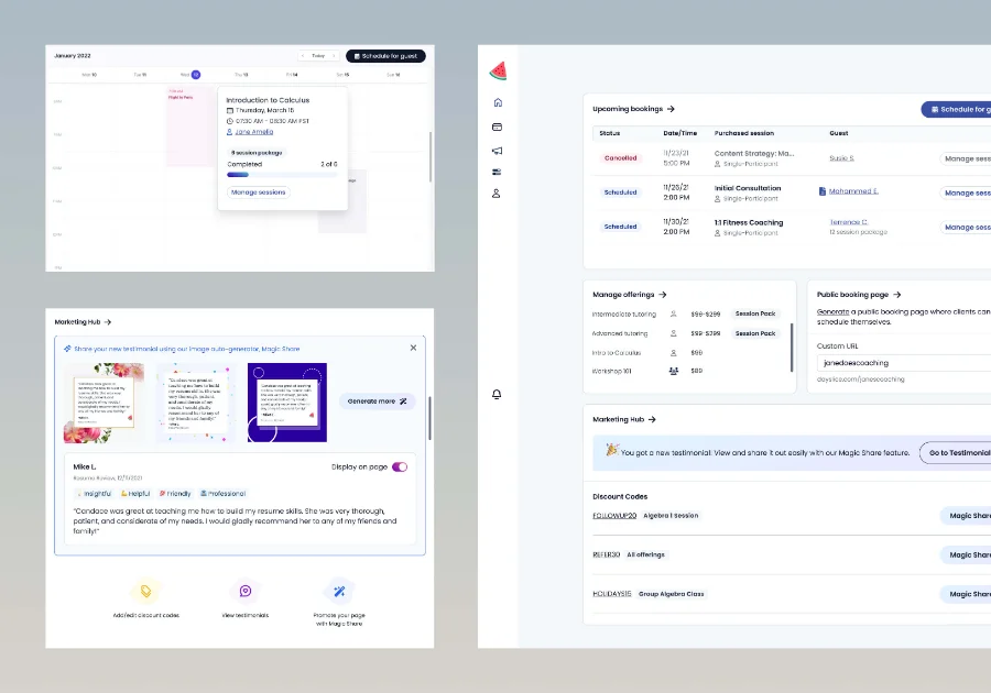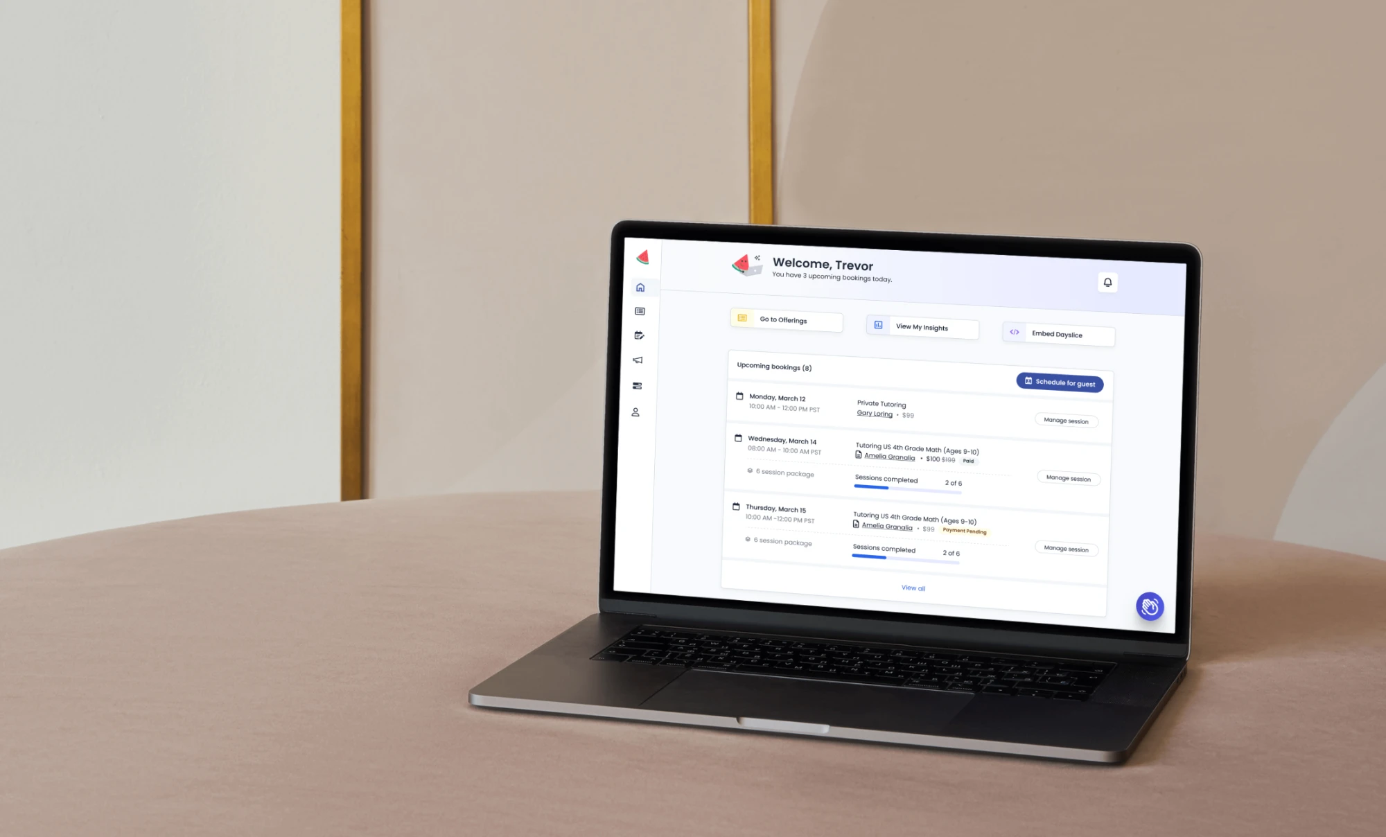
Dayslice in-app homepage shown on a laptop
← Back to work

Redesigning the in-app homepage to drive user activation and clarify product value

Dayslice is a SaaS platform for service businesses to manage bookings, payments, and marketing.

In the span of 8 weeks, I led the redesign to help users discover the real value of the product faster, and guide them toward meaningful first actions that would improve activation and retention. I worked with multiple teams to align on visual direction, product strategy, and technical implementation. I designed new UI and branding components and redesigned our marketing website.

The new design led to a 30% increase in first-session engagement with key features like bookings, offerings, and marketing tools, and helped reduce confusion by surfacing the full breadth of the platform.

Responsibilities

  • UI/UX Design
  • UX Research
  • Visual Design
  • Product Design
  • Product Strategy

Team

  • 3 Engineers
  • 1 Head of Marketing
  • 1 Customer Success
  • 1 CEO / Product Manager
The challenge

Users were dropping off the homepage

Through user calls and existing research, we learned that there were multiple factors for why this happened. When new users signed up for Dayslice, the first screen they saw gave off the wrong product perception. It looked like a public booking page, not a full business platform, so most assumed that was all the product did.
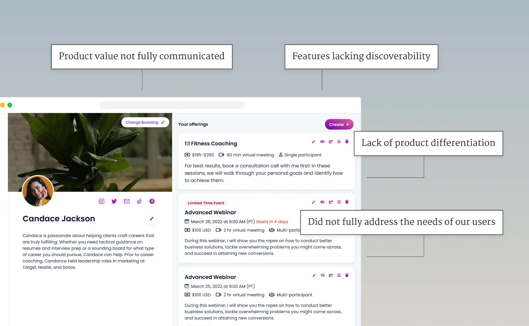
Annotated home page screenshot showing the four key problems
The home page failed to clearly communicate our product’s value, a few features lacked discoverability, lacked differentiation from competitors, and didn’t address the needs of our users’ diverse use cases.

How might we reposition our homepage to increase product value for users?

The approach

Digging into the problem

Given our limited resources in time, budget, and interested users, we didn’t have a lot of opportunities for extensive user research. So I did the following to gather as much relevant information as I can into the problem space:

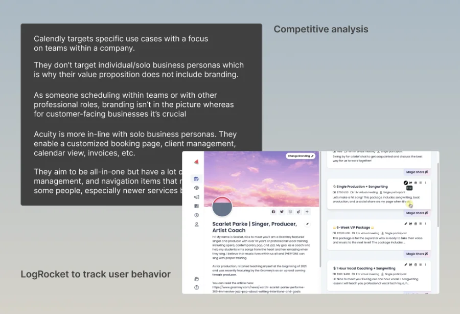
  • Gathered insights from Customer Success, LogRocket replays, and existing user data to identify user pain points with the current product
  • Conducted a competitive audit to identify differentiators
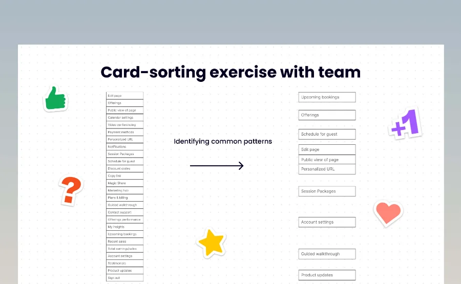
  • Facilitated a card-sorting workshop with the internal team to improve content hierarchy
Competitive analysis board and LogRocket session replays Card-sorting exercise with the internal team

Making sense of the findings

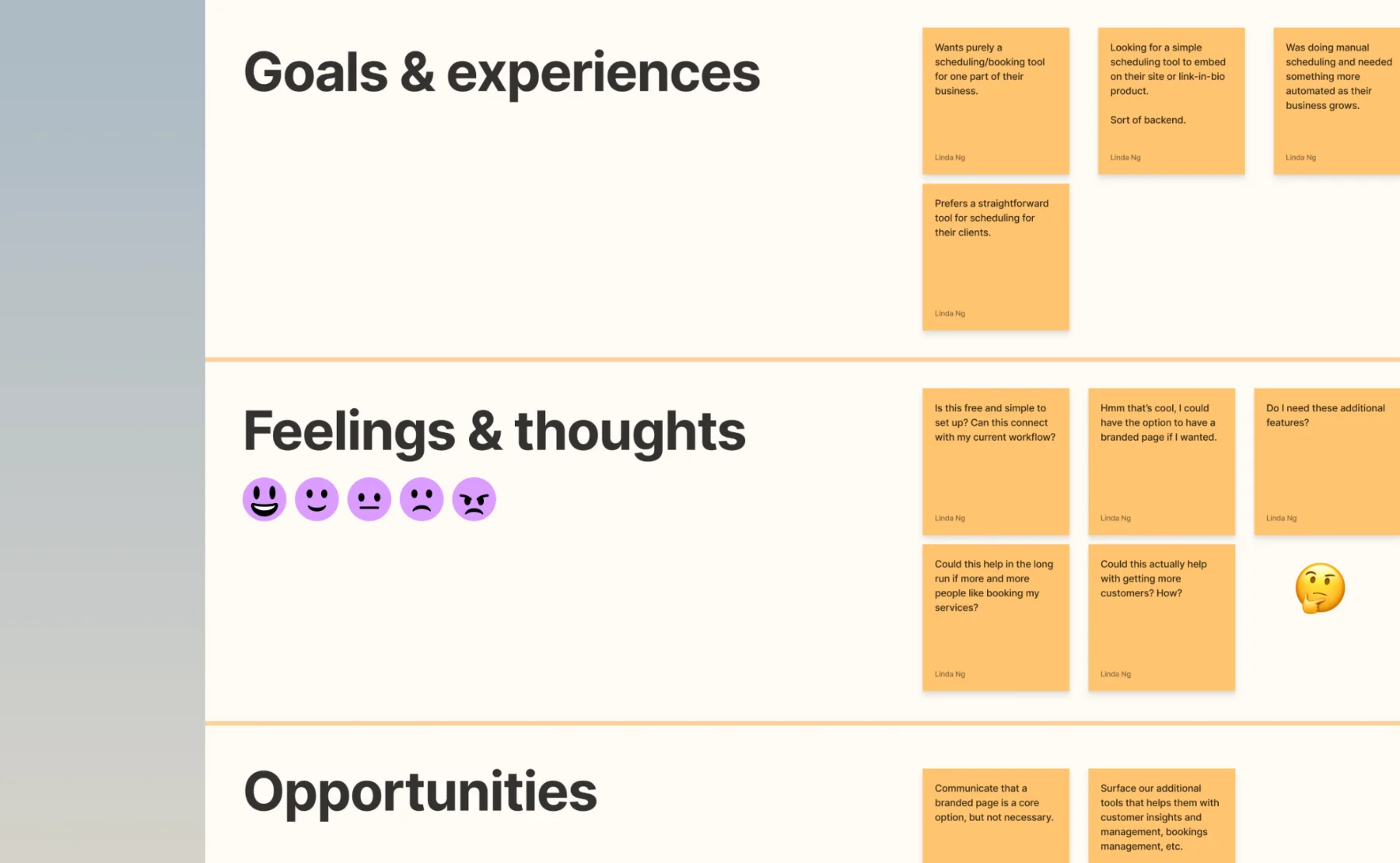
After gathering the research findings, I applied a myriad of specific UX methods to help me think of proper solutions for our defined user types and product use cases.

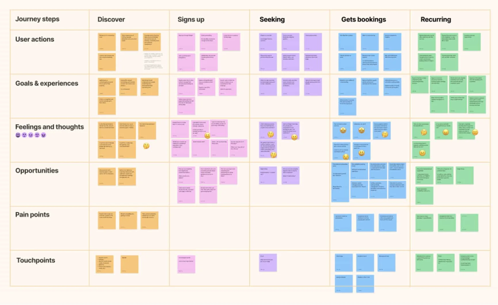
Affinity map grouping goals and experiences, feelings and thoughts, and opportunities Customer journey map across discover, sign up, seeking, bookings and recurring stages
I created an updated customer journey map to identify friction points, drop-off triggers, and pinpoint key opportunities for improvements depending on the user’s stage.
Low-fidelity wireframe explorations Narrowing down the layout options
I explored various layouts to address the information hierarchy and usability needs. I wanted to overcome design challenges and trade-offs of balancing between visual appeal, usability, and functionality.

Testing

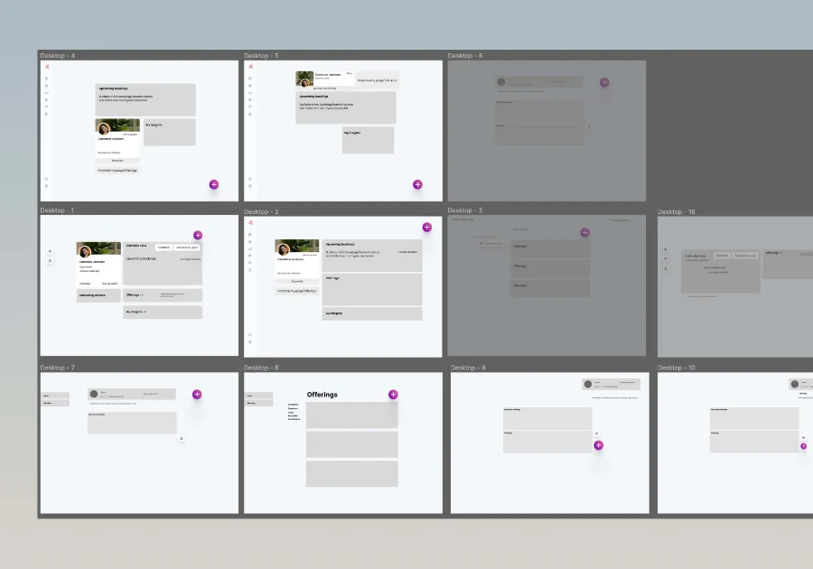
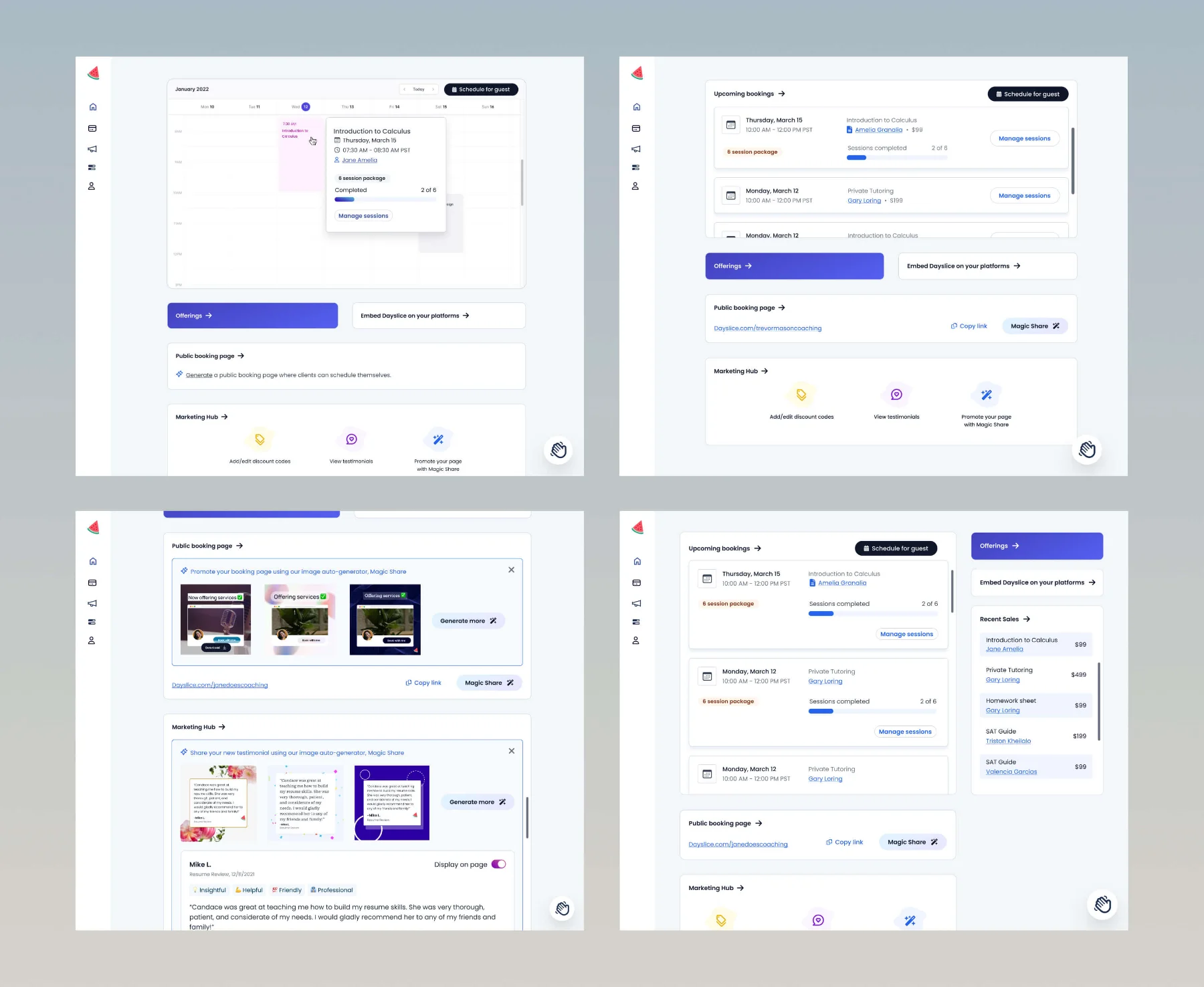
After reviewing with the team, I designed and prepared 4 key mockups for testing with 5 active users to validate our assumptions.

Key feedback:

  • Users preferred the layout with a tab view of bookings because it felt more streamlined and easier to parse through
  • Alternative layouts like the 2-Column view increased cognitive load so it was omitted
The four key mockups prepared for user testing
The final design

Ready for handoff!

It was time to deliver the results to engineering and have the final discussion on the implementation. It took numerous iterations and reviews with the whole team, but we ensured that we were aligned on the visual direction, product positioning, and technical feasibility.

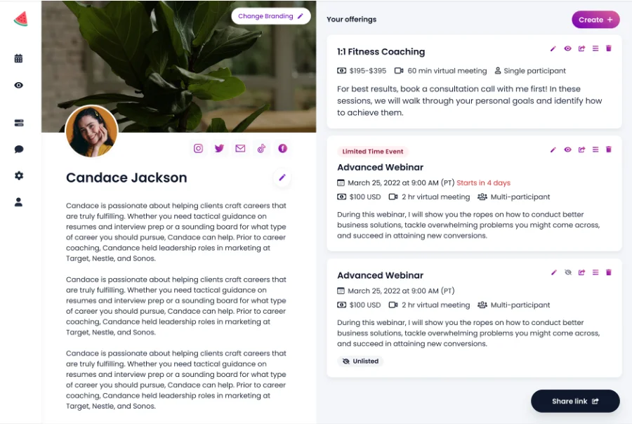
The home page before the redesign
Before.
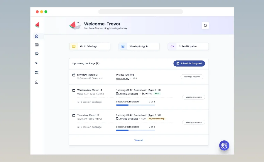
The home page after the redesign
After.
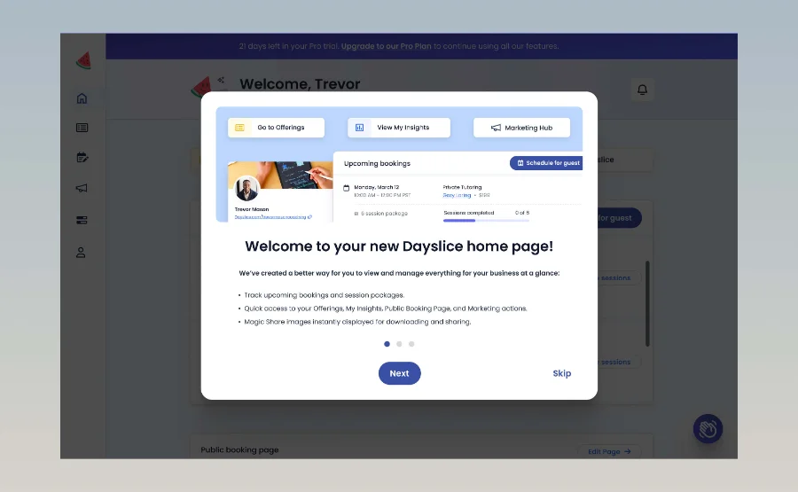
Welcome modal onboarding returning users to the redesign
Onboarding returning users to educate them of the new redesign.
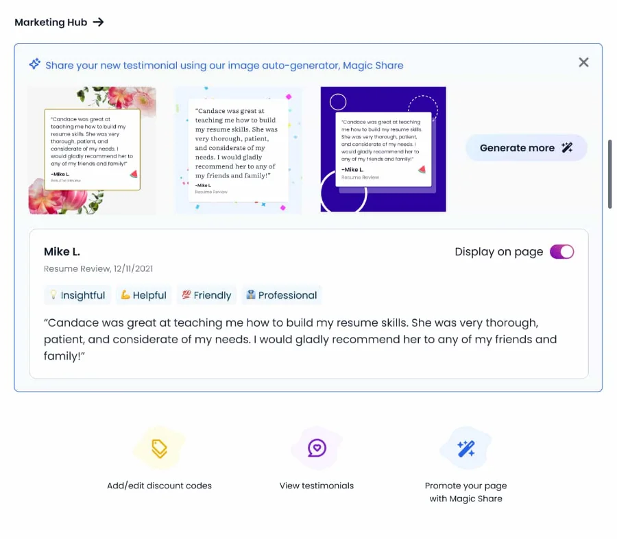
Redesigned marketing hub tile
Redesigned marketing tile to reflect new branding and UI elements.
The impact

Promising results

Through several user feedback and LogRocket (a product analytics tool), we found that…

  • A majority of users found the new UI easy to navigate
  • We experienced at least a 30% increase in feature discoverability and usage
  • We provided clearer communication of value that set us apart from competitors

90%

or more of users had easy navigation with the new design

30%

increase in engagement, discoverability, and usage rates of features

Reflection

Overcoming obstacles

This project required deep understanding of mental models, information hierarchy, balance of visual elements, and user needs and goals. It took time to figure out the best solution for our users with our limited resources, but it helped me understand more complex nuances of design in general.

Moving forward…

  • Set success KPIs earlier to guide decision-making and validate results
  • Simplify more aggressively as some visual elements were over-designed under pressure
  • Push for deeper discovery interviews to refine positioning strategy

Thanks for viewing!

View my other work

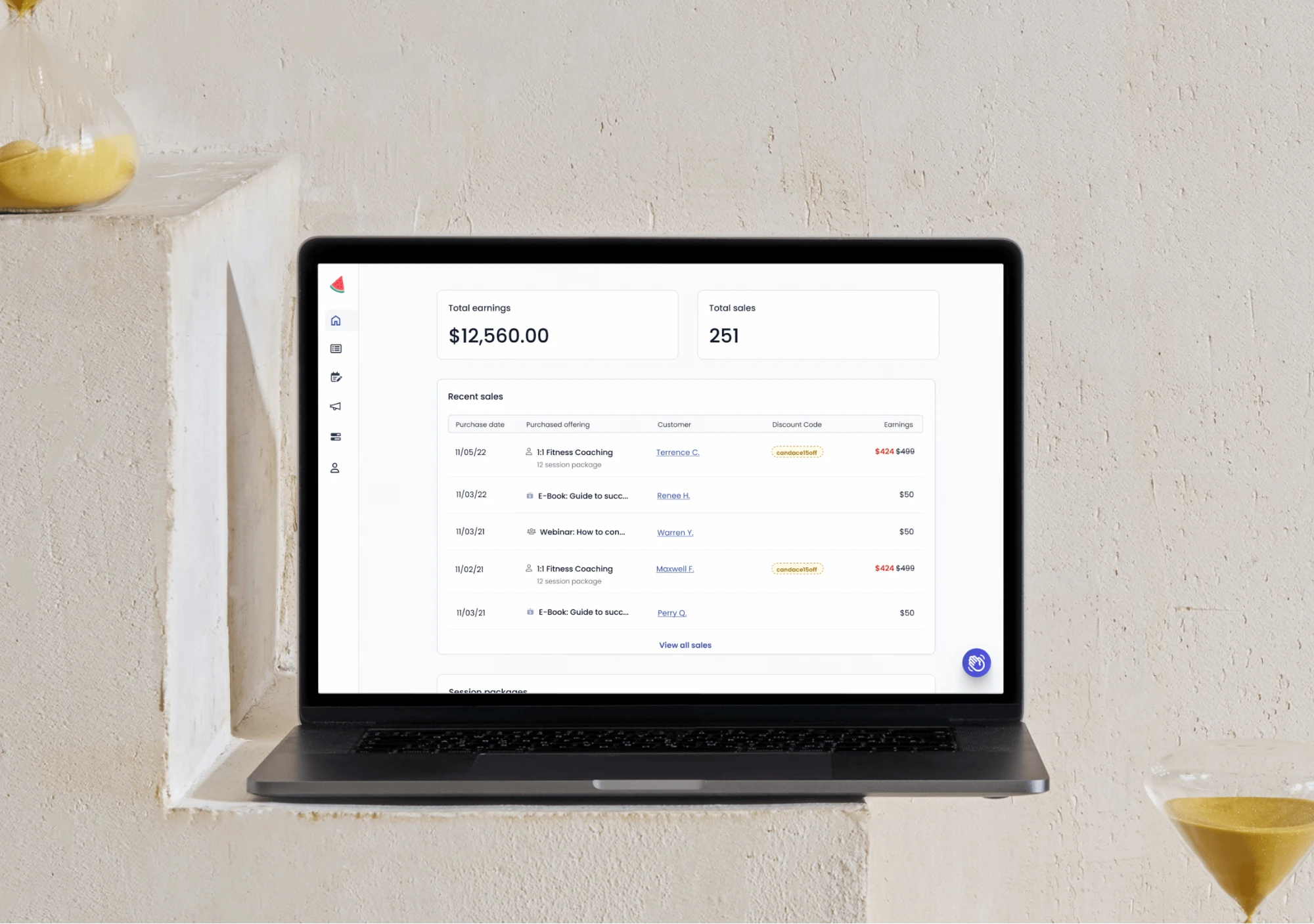
Dayslice dashboard showing total earnings and recent sales

Dashboard insights for retention and growth →